CSS伪类的应用——实现聊天气泡效果
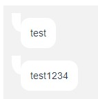
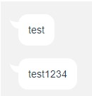
在做聊天室的时候为了实现一个气泡消息的效果,于是目标是要实现一个类似b站私信消息的感觉
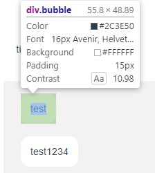
主要原理是利用css伪类的:before和:after在圆角div前后插入两个方块,利用圆角叠加遮盖实现气泡的效果
消息气泡的模板定义如下
1
2
3
4
5
6
7
| <template>
<div class="message">
<div class="bubble">
<slot></slot>
</div>
</div>
</template>
|
由于使用了vue,其中的<slot>为之后插入的消息内容
首先将bubble设置为圆角矩形,因为要适应内部文本大小且要占据一行,因此定义为inline-block,并用div包裹
1
2
3
4
5
6
7
8
9
| .bubble{
display: inline-block;
position: relative;
padding: 15px;
left: 0px;
line-height: 1.2;
background: #fff;
border-radius: 15px;
}
|
之后插入先后插入一个:before和:after块,位置定义为absolute(注意.bubble需定义为relative才能做到相对.bubble块偏移)
:before
 1
 2
 3
 4
 5
 6
 7
 8
 9
10
| .bubble:before {
content: '';
position: absolute;
top: -8px;
left: -15px;
height: 30px;
width: 15px;
background-color: #fff;
border-bottom-left-radius: 40px 60px;
}
|
:after
 1
 2
 3
 4
 5
 6
 7
 8
 9
10
| .bubble:after {
content: '';
position: absolute;
top: -8px;
left: -15px;
width: 15px;
height: 20px;
background-color: #f2f2f2;
border-bottom-left-radius: 100px 40px;
}
|
这里的background-color和背景色设置为相同
border-bottom-left-radius熟悉后的两个值分别表示椭圆的半长轴和半短轴,用来调整角的弯曲度
值得注意的是这里实现的角右侧只能紧贴垂直的边,理论上通过调整top、left、width、height四个值应该可以实现将角移到圆角的部位
最终效果虽然还是有点差别但还是很接近了,
但是b站对于图片气泡直接使用了canvas实现,画一个气泡然后用图片填充
(⊙﹏⊙)学到了